9 Essential Features Your Website Needs in 2023
The essential website features for building a site in 2023:
1. MOBILE-FIRST.
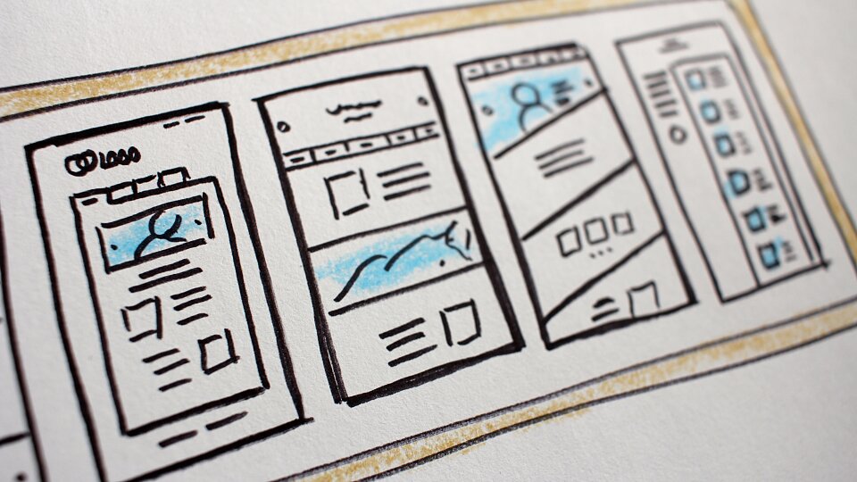
Over half of your site visitors, and the vast majority of your targeted site visitors, will come through mobile. My wife is one of thousands of moms across America who don’t have time to sit at a desktop anymore. They get their Internet through their phone. This means that you need to build for simple – small screen interface, less navigation, less design overhead, more content, easier interface, and add a hamburger in the corner. When making design decisions, choose how it looks on mobile before choosing how it looks on traditional desktops.
2. RESPONSIVE.
This trend began years ago as a response to people who were building separate solutions for separate devices. The goal here is to create a single site solution for all platforms, including mobile, tablet, and desktop. This still matters today, and particularly when it comes to design – create a single, “band” solution where all elements are presented 100% wide in stacked bands of various designs.
3. CONTENT-ORIENTED
As I alluded with the first two, mobile and responsive means you don’t have space for a lot of extra design elements. It’s all about the content. People just want to get to what matters.
4. DATABASE-DRIVEN
When it comes to churches and other organizations with a lot of changing information, put ongoing content into a database wherever possible so it can be called up in multiple places without manual re-entry.
5. FUNCTIONAL
Choose menus and navigation that match your core strategies as an organization. Clear navigation helps people quickly get to what they need. My target is never more than 2 clicks to get to where you need to go.
6. SEO-FRIENDLY
Use software that responds well to search engines. My current favorite is Yoast, which operates as a plug-in with WordPress. It helps you identify good titles, keywords, and other features that make it SEO (“search engine optimized”).
7. BRANDED
The site needs to communicate a sense of purpose. Include a) reason for being -- why the organization exists; b) its values -- who the organization is; and c) vision – where the organization is growing.
8. STORY-DRIVEN
This is related to #3, but different. Wherever possible, use effective storytelling, both still and video. Story both changes hearts and promotes your events and programs.
9. MINIMAL DESIGN
Employ minimal design overhead such as extra shapes and colors, to drive attention to the content itself, e.g. photos and copy. Easy to find buttons and links to make taking action quick and more likely occur.

